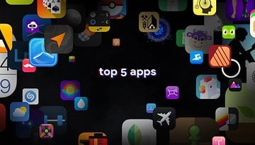
Top Android Apps: Must-Have Apps for Every Android User in 2024

Looking for top-tier Android apps to enhance your smartphone experience? Whether you need AI-generated content, photo editing tools, fitness trackers, GPS navigation, weather updates, music streaming, wellness guides, or productivity boosters, our curated list has you covered. Dive into our 2023 selection of the best Android apps available on the Google Play Store.
This guide focuses on unique and high-impact Android apps. Popular staples like Google Maps, Chrome, and WhatsApp are not included, allowing us to spotlight lesser-known but equally valuable applications.
The best AI chatbot app: AI Chatbot Nova
ChatGPT is well-known, but AI Chatbot Nova is notable for its accuracy. The basic Nova is free with three daily chats, but there's a $4.99 weekly or $39.99 annual subscription for unlimited use, detailed answers, chat history, instant responses, OCR, and an image generator. It's ideal for those heavily reliant on chatbots, integrating well with modern smart homes through features like voice commands.
- Price: Free / Advertising: None / In-app purchases: Yes / Account: Not required

The best AI chatbot app alternative: ChatOn
ChatOn stands out for its ability to source information from diverse content like songs and blogs, offering human-like responses. Its strengths include text recognition, voice-to-text, text-to-voice, and multilingual support.
The basic version is free, but a $6.99 weekly or $39.99 annual subscription unlocks full features. It also offers unique roleplaying interactions and can visualize images of its answers, potentially hinting at future physical robot integration.
- Price: Free / Advertising: None / In-app purchases: Yes / Account: Not required

The best AI art generator app: YouCam Perfect
YouCam Perfect is an AI-driven app that easily transforms photos into art, ideal for those not skilled in photo editing. It removes the complexity of prompts, making it user-friendly, although it has ads which can be removed with a subscription.
It's great for social media users, offering features like cartoonizing selfies, teeth whitening, eye brightening, and digital touch-ups. Additional tools include stickers, animations, fonts, filters, and backgrounds for personalized, impressive images.
- Price: Free / Advertising: Yes / In-app purchases: Yes / Account: Required

The best AI art generator app alternative: WOMBO Dream
The rise of AI art generators like WOMBO Dream, known for their quick and efficient processing of prompts, does not signal the end of traditional artists' careers. These tools, popular for their versatility and user-friendly features, complement rather than replace human creativity.
While they offer convenient options like generating multiple images simultaneously and text editing, the unique value and expression found in hand-painted artwork remain irreplaceable. AI art expands the horizons of creativity, working alongside traditional art forms rather than replacing them.
- Price: Free / Advertising: None / In-app purchases: Yes / Account: Required

The best digital detox app: Forest: Focus for Productivity
Forest: Focus for Productivity is a mindfulness app that uses gamification to help reduce phone distractions. It features a unique focus timer where a seed grows into a tree as you work, encouraging better time management.
However, using your phone prematurely causes the tree to wither. The app allows customization, like setting different trees for tasks and adding motivational quotes, making it an engaging way to improve focus and build productive habits.
- Price: Free / Advertising: Yes / In-app purchases: Yes / Account: Yes

The best digital detox app alternative: StayFree — Screen Time
StayFree helps you track your daily screen time and time spent on individual apps, promoting digital detox by setting app usage limits. It requires access to your phone's usage data and can synchronize with other devices to optimize screen time, aiding in reducing digital distractions and fostering better habits.
- Price: Free / Advertising: None / In-app purchases: None / Account: Not required

The best camera app: ProCam X
ProCam X is a versatile camera app that offers advanced settings like ISO, exposure, and white balance correction, similar to a professional DSLR but in a digital format.
It allows real-time filter application, displays the golden ratio grid for framing shots, and provides various shooting modes including burst and auto-repeat. With a clear interface, it offers quick access to common functions, making it a great alternative to standard phone camera apps.
- Price: $4.99 / Advertising: None / In-app purchases: None / Account: Not required

The best camera app alternative: Pixtica
Pixtica is a versatile photo app, akin to a Swiss army knife, offering both photography and editing capabilities. It features a user-friendly interface, numerous tools, and filters. Key features include RAW photo capture, HDR mode, basic functions like timer and flash management, and options to control ISO, white balance, and exposure.
Unique functions like panorama creation, background alteration, and animated GIFs make it stand out. Its well-organized interface is particularly user-friendly for beginners.
- Price: Free / Advertising: None / In-app purchases: Yes / Account: Not required

The best photo editing app: Snapseed
Snapseed remains a top photo editing app after a year, offering 29 tools and filters for custom edits like brightness, saturation, sharpness, and contrast, both automatically and manually. It includes rotating, cropping, straightening, and supports PNG, JPEG, RAW formats. Key features include object removal, photo stitching, and a user-friendly interface.
- Price: Free / Advertising: None / In-app purchases: None / Account: Not required

The best photo editing app alternative: Toolwiz Photos
Toolwiz is also a fairly successful photo editing application. In addition to offering all the basic functions and tools to edit your photos, the application also allows you to make photo collages, albums, or presentations. Toolwiz stands out for its wide variety of filters and artistic effects such as stenciling, engraving, or even mural painting.
The application offers beauty filters that will artificially slim your face or body, including makeup, or even remove the red-eye effect. You will also find WTF functions like age estimation. Only the rather cluttered interface can be rather difficult to figure out initially, but it is just a matter of time before you get used to it.
- Price: Free / Advertising: Yes / In-app purchases: Yes / Account: Not required

The best productivity app: Stay Focused
Stay Focused is an app that improves your productivity by boosting your concentration levels. It allows you to remove yourself from the digital world without having to turn off your smartphone. The application allows you to choose which website or application you want to block and the corresponding duration.
You can also block the use of your smartphone globally to focus even better. Stay Focused lets you track your usage to make adjustments and have a more balanced life. The interface is simple and customizable, with a dark mode to boot.
- Price: Free / Advertising: None / In-app purchases: Yes / Account: Not required

The best productivity app alternative: Toggl
Toggl is a productivity app that will help you manage your time better. The app tracks your time with several tools like a Pomodoro timer, background tracking based on time spent on a site, or importing data from your calendar.
Toggle has an extension for Chrome and Firefox, but also for several popular applications such as Gmail, Asana, Google Calendar, Todoist, Evernote, Trello, and even Slack. Time tracking can be performed automatically or manually, depending on your preferences. The free version offers most of the basic functions and the application has a very easy-to-understand user interface.
- Price: Free / Advertising: None / In-app purchases: Yes / Account: Required

The best mail app: Blue Mail
Blue Mail is a universal mail app that has been widely praised for its ease of use and clean user interface. It supports multiple email services, including Gmail, Outlook, Hotmail, Yahoo Mail, AOL, iCloud, and Office 365, and allows you to view all your emails in a single, integrated inbox.
It also has its own built-in calendar that syncs with data from all your email accounts, allowing you to access your calendar events directly in Blue Mail.
- Price: Free / Advertising: No/ In-app purchases: Yes/ Account: Required

The best mail app alternative: Cleanfox
Spike streamlines email management, especially for heavy users, by merging email and instant messaging styles. After logging in with your existing email account, it organizes emails into single conversations per recipient, replacing headers for easier tracking. A reply line under each thread facilitates continuous communication, making email checking more enjoyable with its intuitive interface.
- Price: Free / Advertising: None / In-app purchases: None / Account: Required

The best fitness app: 7 Minutes Workout
7 Minutes Workout is a fitness app designed for those who want to work out without headaches. It offers a series of quick exercises that do not require any equipment. The application is based on the principle of high-intensity split training or HIIT, and it includes twelve fitness exercises of thirty seconds each, with ten seconds to recover between each exercise.
With only a chair, a wall, and a little motivation, you can get back in shape or start fitness even if you don't have much time. The interface is user-friendly and prioritizes dynamism, so you only need to press a button on the main screen to directly start the workout.
- Price: Free / Advertising: Yes / In-app purchases: Yes / Account: Not required

The best fitness app alternative: FizzUp
FizzUp is actually a sports coaching service offering several workout programs for different goals. Do you want to build muscle, lose weight or simply stay in shape? The application offers more than 300 video exercises requiring no equipment, 250 healthy recipes as well as evaluations to check your progress.
The application allows you to follow a sports program adapted to your abilities and objectives. The workouts last about 20 minutes on average. There are 15 levels, each with 6 to 21 sessions. FizzUp also offers yoga and meditation sessions. The interface is pleasant to use, except for the intrusive invitation to subscribe to the premium package.
- Price: Free ($19,99/month) / Advertising: No / In-app purchases: Yes / Account: Required

The best note-taking app: Joplin
Joplin is considered to be one of the most comprehensive note-taking apps on Android. In this open-source tool, your notes are searchable, and can be copied, edited or labeled directly from the app and even from the text editor on your PC if you don't have your smartphone. The app has the advantage of supporting the MarkDown format, which facilitates lightweight markup and offers easy-to-read and write syntax.
In addition to note-taking, Joplin allows you to create to-do lists that will be synchronized across multiple devices. This synchronization is protected by end-to-end encryption. The application is extensible with customization plug-ins that make the experience even better.
- Price: Free / Advertising: No / In-app purchases: No / Account: Not required

The best note-taking app alternative: Note For
Note For is an efficient journal app that facilitates quick typing of thoughts, ideal for diaries or journals. It offers user-friendly formatting and customizable themes.
Users can maintain multiple diaries for different aspects of life, albeit with a 1,800-character limit per entry. Signing in unlocks additional features like calendar access and cloud saving, with the option to export your diary entries.
- Price: Free / Advertising: No / In-app purchases: Yes / Account: Not required (but recommended)

The best navigation/GPS app: Sygic
Sygic GPS Navigation & Maps is a fairly popular GPS app that claims to be the best alternative to Waze. It allows you to download maps for offline viewing. The application uses TomTom maps and offers free updates of maps and points of interest. With its "realview" system, Sygic displays images of the road you are driving on, with speed limiters signs detection.
The route search is fast and intuitive. It is possible to record the location of your parked car, a history of places visited, and there is an SOS mode that will help you locate and contact the nearest emergency services. The application has a sleek and successful interface that displays accurate and clear 2D or 3D maps.
- Price: Free / Advertising: No / In-app purchases: Yes / Account: Not required

The best navigation/GPS app alternative: Mappy
Mappy is all about the variety of transportation options it supports. The app allows you to plan your routes by comparing all modes of transportation such as car, public transport, cab, plane, Uber, train, BlaBlaCar, bike, shared bikes, and even electric scooters as well as walking routes.
You can plan your trips by accessing all the traffic data in real-time. The maps are accessible even without an internet connection and the application also allows you to determine the costs of the trip as well as find points of interest. Mappy has a clean interface that goes to the essentials.
- Price: Free / Advertising: No / In-app purchases: No / Account: Not required

The best weather app: Weather & Radar
Weather & Radar is a fairly comprehensive weather app that stands out for its instant weather forecasts. The app provides access to reliable hourly and daily forecasts with a real-time weather animation radar. You will also have information such as weather alerts in case of dangerous phenomena, snow weather, water temperature at the seaside, snow weather, or UV index.
The application also has a pollen indicator that shows the pollen forecast of allergenic plants. The other strength of Weather & Radar is its well-thought-out widget, which is very practical to inform you quickly without having to go into the application. Despite the richness of its information, the interface is clear, and the elements are well arranged.
- Price: Free / Advertising: Yes/ In-app purchases: Yes/ Account: Not required

The best weather app alternative: Meteociel
Very complete and easy to understand, Meteociel is an efficient weather application. On the homepage are highlighted the trends of the cities added to the favorites and their live temperature maps. The application displays a detailed weather report with air pressure, cloudiness, and humidity, as well as average speed, gusts, and wind direction.
It is also possible to consult different live maps and to get the weather forecast. It is also possible to consult different live maps, access official records from different weather stations, or consult all the maps of the weather forecast models. The dark interface is pleasant to use and intuitive.
- Price: Free / Advertising: No/ In-app purchases: No/ Account: No required

The best reading/audiobook/podcast app: Kobo
With Kobo Books, you can read your eBooks and listen to your audiobooks on your smartphone pleasantly. The app has a collection of over 100,000 eBooks and audiobooks in various fields and genres. You'll just have to buy a title on Kobo.com before syncing your app to be able to read or listen to it at any time.
You'll be able to start your reading on one device and finish it on another by syncing all your bookmarks. Kobo also offers free excerpts to help you choose a book to read. The experience is enhanced by features like the ability to choose between day and night mode, font size and even look up words with the built-in dictionary.
- Price: Free / Advertising: No/ In-app purchases: Yes/ Account: Required

The best reading/audiobook/podcast app alternative: Podcast Addict
Podcast Addict is an app that centralizes podcasts from different sources. You will be able to search by name or keywords among the five million podcasts and over one hundred million episodes. Podcast Addict also offers access to audiobooks, radio shows, and YouTube or Twitch channels. You will be able to subscribe to multiple podcasts, download episodes and receive notifications about the latest audio content published.
The application allows you to access episodes in different languages in addition to French, and the audio player is fully customizable. You will be able to modify the settings according to the podcast you are listening to and save them.
- Price: Free / Advertising: Yes/ In-app purchases: Yes/ Account: Required

The best online storage app: pCloud
pCloud is an online storage app with a very interesting offer. Thanks to its storage offer valid for life after a one-time payment, you won't have to bear monthly fees. The application has a simple interface and offers full encryption of your data for transfer and storage, as well as synchronization of your documents stored on all your devices.
You will be able to download, move, rename, view or listen to all your files no matter if you are on a smartphone, PC, Mac, or even Linux.
- Price: Free / Advertising: No/ In-app purchases: No/ Account: Required

The best online storage app alternative: Mega
With Mega, you can store up to 20 GB of data for free. Thanks to synchronization, you will be able to access your files on any device. You can protect access to your data with a password. The application favors file sharing with its shared folder, but also allows you to transfer heavy files by downloading them and then just sharing the generated link.
Mega allows you to easily access your cloud storage usage statistics, drag and drop content directly to the web interface, preview documents and even play videos via a built-in player.
- Price: Free / Advertising: No/ In-app purchases: No/ Account: Required

The best dating app: Once
Once is a dating app designed for those who want to take their time to meet someone worthwhile. The particularity of the application lies in the fact that it displays only one profile per day. Over time, the algorithms improve to recommend more and more appropriate partners.
Once focuses on meetings that can lead to a serious relationship. Personalizing your profile will improve your chances of finding the partner you are looking for. The interface of the application is a bit busy especially with the rating function.
- Price: Free / Advertising: No/ In-app purchases: Yes/ Account: Required

The best dating app alternative: Bumble
Bumble has the same basic functions as most dating apps but adds practical features such as friendship and business dating. Unlike Tinder, in particular, Bumble gives the initiative to women for dating by forbidding men to make the first contact.
In addition to the rather successful chat function, you will be able to send voice messages, play a mini-game of questions and answers to get to know each other, send photos and launch a video call.
- Price: Free / Advertising: No/ In-app purchases: Yes/ Account: Required

That's all for our selection of the best Android apps to install on your smartphone in 2024 as the year comes to a close. What are your favorite Android apps? Do you have any other suggestions?
The Best Android apps article was updated on December 2023, to add three new categories to the recommended list.


Very great article. How can I turn on notifications for your latest posts?
As i am android user so this app is very sueful
Thanks for sharing these wonderful apps with us. Are these applications freeware or paid?
-
Admin
-
Staff
Nov 30, 2022 Link to commentEach one of them has a different license.
We tried to list every one of them above.
Best browser: Vivaldi.
What?! You mean Gmail isn't thee best email app EVER?! Blasphomy! I am app.alled and demand yadiyadi yada. This list wreaks of reguurgled, shilled spew.
Thank you for your feedback. We really App.reciate it :P
Android app development has become the core of mobile strategy today and most large, medium and small businesses have started to realize the potential benefits offered by the robust applications. Worldwide, the demand for android apps is increasing exponentially. Realizing this, we at Hakuna Matata develop advanced Mobile applications that mitigates the enterprise challenges and help in improving your organization’s growth and revenue.
Evernote is my most critical Android app. I'm not a fan of how they push their paid programs so hard in the new release. Nor the default home page you can't tweak without their current paid memberships. I do have a paid membership, but it's grandrathered from over a decade ago and gets none of the new "features". Still, the app is a great tool.
As to ereader, I think you succumbed to the walled garden style of thinking. The best e-readers are the independent tools like FBReader and Librera. More format support, better controls, less snooping. Use Calibre on your desktop/notebook with the appropriate plugin from ApprenticeAlf and free your reading experience and book supply chain.
Snapseed and Strava are the best apps suggested by you. Thank You for such good and informative information.
Thank you. I love Evernote and Snapseed.
-
Admin
Dec 26, 2019 Link to commentlong and interesting list.Useful
It’s not easy deciding which apps to download and install on your Android phone or tablet. here is the best background remover app on play store
**[Image Cut Paste & Background Eraser][2]**
[2]: https://play.google.com/store/apps/details?id=image_cut.background.eraser.background_changer.image_cut_out
That's a long list of apps you included there, as a developer it gave me many ideas for my work in app development in Android.
Hi!
There is a new app in Android called ChatsOffline, that is great to protect your time, it can help you to pause your chats (WhatsApp and Facebook Messenger for free), so you can focus on your work and family time.
For note Taking purpose I use Microsoft's "OneNote". I find it more versatile, powerful and free from the kind of restrictions imposed by Evernote in its freemium model. Further, Microsoft will exist in continuity in foreseeable future while there is no guarantee for Evernote.
I think, WhatsApp is the most popular one in the list. Its very useful communication app which almost everyone uses in regular basis.
Recommended years ago on AndroidPit (and still using):
WeatherBug
Security Master
Nova Launcher
The best diary for personal space, ideas and creativity - Diary Lifestyle.
How does someone recommend McAfee and Avast and still go home to their family at night and look them in the eyes?