Nothing OS 2.0 Review: This Is My New Favorite Android Interface


Nothing OS 2.0, the Nothing Phone (2) interface based on Android 13, is fast becoming my favorite Android overlay. I explain why in this comprehensive Nothing OS 2.0 review, and give you my honest opinion.
Nothing OS is a fairly uncommon interface on the Android market. It's clearly not as mainstream as Xiaomi's MIUI 14 or Samsung's One UI 5.
Logically, Nothing OS only runs on Nothing smartphones, of which there are two. And Nothing itself has only been around for three years. Nevertheless, Nothing OS 2.0 already shows certain maturity. And I think the interface strikes a good balance between customization and lightness.
Maybe it's my latent fanboyism that makes me say this, but Nothing OS 2.0 is well on the way to becoming my favorite Android interface, sorry One UI.
Table of Contents:
- Nothing OS 2.0: Design
- Nothing OS 2.0: Features
- Nothing OS 2.0: Privacy
- Nothing OS 2.0: Ergonomics, fluidity, and stability
- Nothing OS 2.0: Updates and compatibility
- Nothing OS 2.0: Conclusion
Nothing OS 2.0: Design
Nothing has almost completely reworked the design of Nothing OS 2.0 compared to the first version. We've got a good mix of Android 13 implementations with just the right amount of customization options on top.
Android 13's dynamic themes and themed icons are back, for example. This allows you to synchronize the color of the interface with the dominant color of your wallpaper.
")
But you can also superimpose the Nothing theme. The latter applies a monochrome, pixelated look with shades of black, white, and grey, but also a few touches of red (not really monochrome, in fact). It's visually very appealing and fits perfectly with the brand's visual style. Especially since Nothing has made the effort to apply its theme to several third-party application icons.
Nothing has kept the good aspects of the first version of its overlay. I liked the two large bubbles at the top of the quick access menu for network and Bluetooth.
")
The giant application icons are also still there. You can also create large folders and apply a Nothing-themed stylized icon to them.
Some widgets also feature animations to display more content. This is the case with the weather application, among others, which allows you to scroll up and down to access more information, in the manner of a "stacked widget."
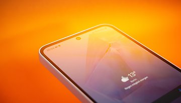
But it's not just the home screen that benefits from a visual overhaul. The lock screen has been drastically redesigned. You can now add widgets and, above all, system shortcuts.
 Review")
No more scrolling through the quick access menu to activate the flashlight, connection sharing, or anything else. It's ultra-useful and intuitive. In all, there are 8 slots for your widgets/shortcuts. Some of them can occupy several slots, but you can adjust everything to suit your needs.
")
Always on display is also available, and works in the same way as Apple. It dims the wallpaper and leaves the monochrome clock and lock screen widgets visible.
Nothing OS 2.0: Features
Here, we'll be talking mainly about features linked to the Glyph interface, at the heart of the Nothing Phone (2) user experience. Well, "at the heart of" would be a bit of an exaggeration. But the Glyph interface is far less gimmicky than on Nothing OS 1.0 or 1.5.
 Review")
We find the classic functions of the previous version to associate different ringtones/notification sounds with light animations. The "Flip to Glyph" function, which displays visual notifications when the smartphone is placed face down, is still there too.

But Nothing OS 2.0 brings three new features, two of which are major and the other still experimental. Let's start with the two most interesting: the Glyph Composer and the Glyph Timer.
The composer lets you create your own Glyphs. Instead of selecting from predefined sounds and animations, you can compose your own melodies and light signals.

5 different soundboards are available. Each offers 5 types of sound, with different tones and rhythms. You then have 10 seconds to record your compositions.
Personally, I find this feature totally brilliant. I know you're going to laugh at me. But this gamification of a simple setting in the parameters adds a lot of depth to the user experience, in my opinion.
Nothing promises to release a new sound pack every quarter in collaboration with artists. These sounds will expand the composer's repertoire to vary the pleasures. My only regret is that I can't mix several soundboards together at the moment.
The other interesting new feature is the Glyph timer: you set the timer, lay the smartphone flat, face down, and you can watch the time elapse with a light bar that gradually empties.
It's great for cooking pasta or eggs. Personally, I'm thinking it could also find usage in terms of productivity, like a Pomodoro timer.
A final addition to the Glyph interface is the ability to track your Uber or other deliveries. You can display a progress bar that fills up as your delivery driver approaches your home, for example. For the moment, only the Uber application is supported. I don't really see the point, personally.
In the experimental features menu, you can also find the "Connect to Tesla" function, which I haven't tested as I'm a pedestrian and underpaid, as well as "AirPod support", which I haven't tested either as I have common sense and don't use AirPods (just kidding, please don't insult me).
You can also increase the screen's touch sampling rate, to make it more responsive for mobile games.

Nothing OS 2.0: Privacy
In terms of privacy, there's not much to say or say against Nothing OS 2.0. Nothing implements the Android 13 feature set. You can manage all your application permissions, accounts, and passwords, with security check-ups for your Google account, for example.
In terms of bloatware, the Phone (2) doesn't really have any, unless you consider mandatory Google apps to be bloatware, which I don't. The only native apps on Nothing OS are the Google apps.
The only native Nothing OS 2.0 applications are Photo, Composer, Weather, and Recorder. Nothing OS 2.0 includes no advertising in the interface.

Nothing OS 2.0: Ergonomics, fluidity, and stability
I tested Nothing OS 2.0 in two versions. The initial version 2.0.0 and then the update deployed after the smartphone's official launch, i.e. Nothing OS 2.0.1.
I noted no major bugs or slowdowns during my test. Overall, the interface was very fluid, especially with the Nothing Phone (1) 120 Hz OLED screen. Animations, while discreet, scrolled reliably across the screen.
Nothing OS 2.0: Updates and compatibility
Nothing has already released a patch for Nothing OS 2.0, the same week as the launch of the Nothing Phone (2). It's not bad for responsiveness, and I hope the manufacturer will continue its efforts.
Nothing also guarantees up to three major Android updates and four years of security updates for the Nothing Phone (2). This is in the upper-middle range of what most Android manufacturers offer, apart from Google and Samsung, who always stay on top.
- Check out our guide: How many updates Samsung, Xiaomi, Google, and others offer

As I write this, on July 17, 2023, and after the upgrade to Nothing OS 2.0.1, I still have the June 2023 security patch.
As for the Nothing Phone (1), the manufacturer plans to roll out Nothing OS 2.0 in August. If you're interested, I'll update this review with my impressions of the Nothing Phone (1).
Nothing OS 2.0: Conclusion
Nothing OS 2.0 still has some way to go before it becomes as mainstream as other Android overlays such as MIUI or One UI. But for such a "young" interface, I find it already very mature.
I really appreciate the balance between a streamlined experience close to Android Stock in some places, with just the right amount of customization to give it a real personality.
 Review")
The Glyph interface is undeniably more useful than the first version. Even if it wasn't very difficult to achieve it, I admit. The good implementations of Android 13 in terms of personalization and privacy are also a good thing. As is the absence of bloatware.
But it's the overall look that really sets Nothing OS 2.0 apart. I'm just missing some multitasking and productivity options, as well as more native applications (a note-taking app, for example) to perfect the user experience.
What do you think of Nothing OS 2.0? Does Nothing's interface seem complete enough to compete with MIUI or One UI? Which elements of Nothing OS 2.0 do you think should be improved? And if you're using a Nothing smartphone, have you experienced any significant bugs or stability issues with Nothing OS?
 2022 Product Image")

 Product Image")


 Product Image")

Hello Antoine!!Thanks for this review, i'm waiting for the launch to really test all the glyph thing witch i find very cool!!I'm experiencing some difficult to find this N1 absolutely amazing because the lack of a call transfer feature that is causing considerable inconvenience and negatively impacting my ability to fulfill my professional responsibilities. Can i ask you to check if the 2.0 solve this problem? I would be thankfull!!