Best productivity apps for Android: manage your life like a pro


Smartphones and tablets can be a great way to kill time and socialize, but who knew that they can also boost your productivity? As long as you know the right apps that can lend a hand, your life could become a lot easier. Here is our list of the best productivity apps.
1. Tiny Scanner - PDF Scanner
If your work requires a lot of document scanning, you should be armed with Tiny Scanner, which allows you to create PDFs from any documents using just your smartphone camera.
Take a snap, crop it, and select a PDF page size (like 8.5" x 11", or A4), then hit the tick button. It's that simple. Tiny Scanner will produce a black and white scan of a document that looks as good as if it came out of a scanner.
It has a few neat tools, like automatically straightening your scans if they're a bit wonky, but you'll need a decent(ish) camera for best results. Colorful PDFs tend not to look as strong, but it's an effective replacement for a home scanner, and color is an option if you want it.
While it used to offer pretty much everything for free, there's now a Pro version that you'll need to pay for if you want to do things like upload your scans straight to cloud storage services.
2. LastPass Password Manager
It's a pain to keep track of all your login credentials for the different websites and services that you use, and even worse when you actually forget them and lose access to critical information. That's why a password manager is essential for the high-functioning user.
LastPass is one such service, which saves all of your passwords and other sensitive credentials in one place. As well as remembering all your passwords, the app can log you in to websites and apps automatically, and generate strong passwords for you on the fly. This works via the in-app browser but also via Safari and Chrome.
The free version of the app should cover most of your needs, and even includes cross-device syncing of your credentials and vault, but there's also a premium subscription model with additional features for power users.
${app-com.lastpass.lpandroid}3. Evernote
Many of us rely more and more for our smartphone to do our short and long-term planning, scheduling and reminders, so having an app that does these things is critical. Evernote has a lot of those functions that make it an essential app for productivity. Evernote is for more than just note-taking, you can also schedule appointments, set reminders, take notes, and so much more.
Though Evernote does offer a ton of different organizing options, it remains very easy to navigate. There are other note taking and scheduling apps out there but none do it with the balance and functionality of Evernote.
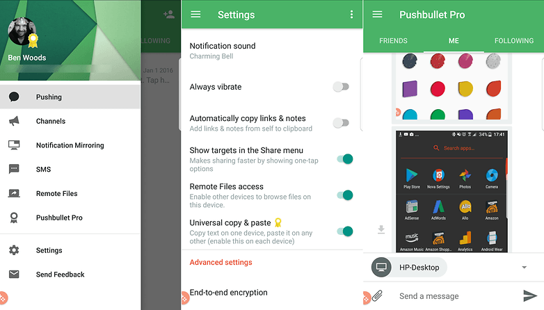
4. Pushbullet
Pushbullet is an incredibly useful app if you spend most of your day sat at a computer and frequently find yourself switching between different devices. It started out as a way to send individual files between those different devices - mobile and desktop, as well as mobile-to-mobile). Now, you can move files, respond to notifications, SMS, and other messages directly from your desktop.
It supports end-to-end encryption, and remote file browsing across connected devices, providing that you enable that feature.
Pushbullet used to be one of my favorite apps in any category, just for its sheer handiness - but then the company started charging for some of its most useful features. Eventually, I gave in and paid the annual subscription, but you can use it for free if you don't mind limited file sizes for sending and don't need to respond to notifications from the desktop.
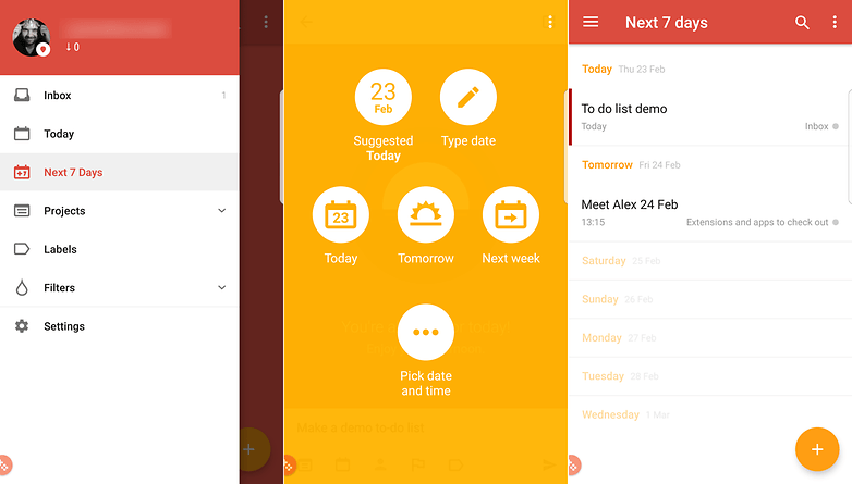
5. Todoist
Plenty of apps have tried to tackle that perennial problem of helping you actually get things done, but Todoist hits a higher water mark than most. The app enables you to organize your tasks with colors and sub-folders, and it can sync your lists between multiple devices (though it also works if you go offline).
It was previously named one of the best Google Play apps by Google itself, and it's easy to see why — the interface is clear and uncluttered, creating and editing tasks is very straightforward, and extra features such as being able to assign custom tags to keep everything organized really add to the app's overall impact on your productivity.
Again, you'll need to pay for a subscription if you want to use the more advanced features, like tags, but basic lists and syncing between devices is free to all.
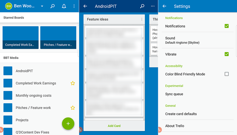
6. Trello
Trello allows you to keep on top of multiple projects and tasks without collapsing in a heap of information overload. If you need to be able to check in on several different projects at once from your smartphone or tablet then Trello is one of the best ways to go about it.
The app is based around cards — each card can have members, labels, dates and other information attached to it, so it's simple to use despite being very powerful. Everything is synced to the cloud as well so you can access your Trello account from the web as well as your mobile devices.
7. DropTask
If you need a to-do list app, but find that simply having lists isn't enough to keep you organized and on track, DropTask could be worth a look, as it takes a more visual approach to your list of jobs. It's also accessible via the desktop too, which is handy.
It's designed for team collaboration, so you can assign tasks and track progress across different tasks for different people within the app itself. And yep, you guessed it, all this organisation takes place through dragging and dropping the tasks.
The free version of the app allows you to create up to five projects for free, with unlimited tasks and groups. If you want to remove this restriction and get access to other features (like assigning tasks to team members) then you'll need to pay for the service.
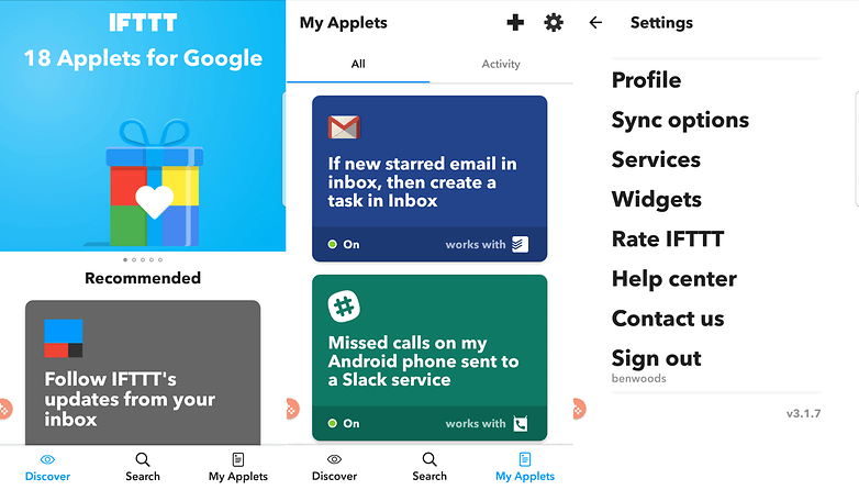
8. IFTTT
If you haven't yet discovered IFTTT then you're in for a treat — it lets you combine various apps and services together to help you get more done. They used to be called 'recipes' but are now called 'applets' instead.
So, for example, if you want to automatically send a map of your location to your Gmail account with a tap on an Android Wear device, sync Dropbox files to other services, switch on your lights or other internet-connected devices around the home or many, many more things, then IFTTT is a one-stop-shop of productivity.
Triggers can be set based on your Android device's location or a specific date and time, and creating your own applets is simple too.
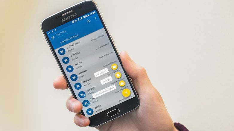
9. Solid File Explorer
If you're using your smartphone as a mobile workstation, then a file manager app is essential, but depending on your manufacturer, your device may not come with one. While there are many good file manager apps with different strengths and weaknesses, Solid File Explorer may be the best overall.
The app has an elegant material design and a simple dual display function to let you drag and drop files into different folders. Other features of note are integration with cloud storage solutions such as Dropbox, Google Drive and OneDrive, and support for Chromecast.
Currently, the app is offering a 14-day free trial. After that, it's $2 to unlock the full version, which is a great price for a very useful app.
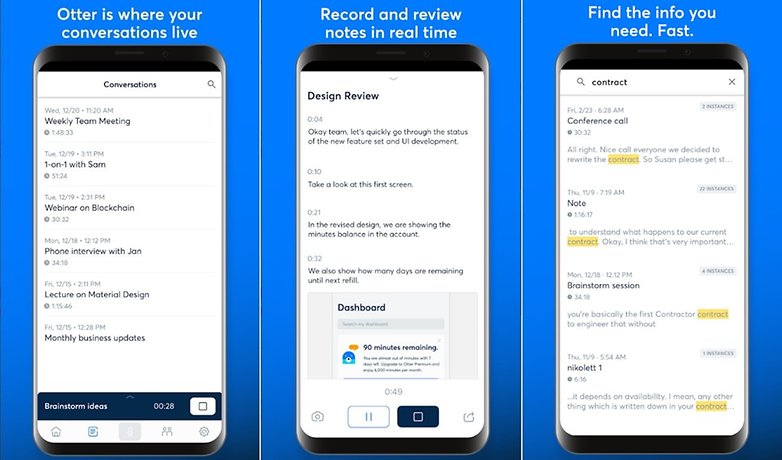
10. Otter Voice Notes
Otter is a productivity app centered around organizing your voice conversations. It records audio from your device and creates transcriptions, that can be annotated with speaker identification, photos, searchable playback, shareable links and more. Whether you run a business, work in media or journalism or need to keep your study notes in order, this handy app will help you keep all the voice info you have from interviews, meetings, etc. easily accessible and sortable. The free plan offers users 600 minutes of transcribed audio every month. A $9.99-per-month subscription multiplies it to 6,000 minutes.
Bonus: Google Suite
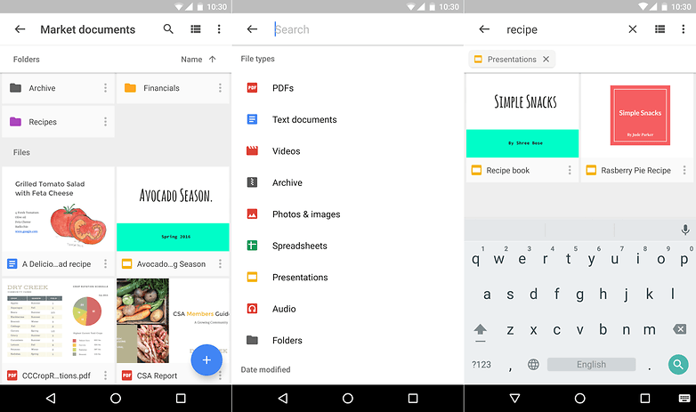
Google's own productivity suite should be one of your first stops on the productivity train — note that Docs, Sheets and Slides are now available as standalone apps as well. In terms of the main Drive app, it lets you access and view files stored in the cloud and synced from your connected computers, and any that you particular rely on can be cached to access offline. A handy tip, Google Drive also has a built-in scanner, too.
The individual apps let you create documents, spreadsheets and presentations from your mobile device. Whether you need to apply some last-minute edits to that company report on the journey to the office, or you're busy working on your novel during lunchtime, these polished apps make it look easy.
Of course, as many Android phones now offering these as pre-installed options you shouldn't need to look too far to find them.
What's your favorite productivity app? How does it help you manage day-to-day life? Let us know in the comments below.


I would like to recommend "Habit Bull - Habit Tracker".
This is still a relevant article and I’ve tried Evernote in the past but have found using Todoist along with Ifttt allow me to log what I want to keep track of. Another app I use which allows me to track all kinds of information in notes is google keep.
PDF? I want handheld OCR!
What an amazing yet informative article
I like this sort of Articles that are specially curated to provide readers something new everyday )
Keep up the good work!
For document scanning, I use Office Lens, which has a very useful feature: automatic paper edge detection. Saving documents can be done in various formats (JPG, PDF, OneNote, Word, PowerPoint) and can also be saved in cloud on OneDrive.
It is easy to use because it has an intuitive interface.
I recommend.
You can also use Google drive to scan documents. Although, stand alone scan apps has more features, Google drive just works for me. As far as password managers go, I'd rather stick with Lastpass. A note app like Evernote/Keep comes in real handy too.
Very Much useful information and I found something similar that help you guys.
There are so many productivity app and we have to choose best one.
Here is the list
#1. To Do List
#2. Evernote
#3. Google Keep
#4. Microsoft Outlook
#5. Unclouded
#6. Swift Key Keyboard
Paste This link on Browser
www.tipskitricks.com/2017/03/10-productivity-app-to-manage-time.html
Here is a updated video of top 10 apps to make you productive .Just search for "techbygeek" on youtube and watch his latest video
I released a productivity app too: https://play.google.com/store/apps/details?id=com.kila.addnotification.lars
It is optimized for creating notifications fast and lightweight
I expected a more insightful list from Androidpit. This article just rehashes the old favorites while perpetuating some controversies. First, what's it about Pushbullet? According to you, is it good or isn't it? I wonder how many of us will be willing to pay a monthly fee just for the ability to move files between different devices? There are other apps which do the job for free, though I admit that they lack the finesse and intuition of Pushbullet. Second, why do you keep repeating the benefits of IFTTT while completely ignoring Tasker, which is a close competitor? Third, I don't know what Google Drive is doing on this list. Is it really a productivity app? Hardly can be described as one. It's just the online repository while you work with Word or PowerPoint on the cloud. Beyond that, just another file storage site (no basic difference from Kim Dotcom's megaupload.com). Nope, I refuse to accept that Google Drive is a productivity app.
And yes. Don't you think a file explorer app should've been on this list?
Good article!
And the comments are very useful too!
Nice list. I've moved on to using google drive more, started using todoist, and replaced Evernote with Google keep and MS OneNote. Always started using IFTTT. Has it made me more productive? Somewhat. At least now I'm not forgetting what needs to be done, but it still doesn't mean that it gets done on time, but I'm improving.
nice compilation
I tried dto download SunriseCalender from Google Play it got a message that the app wasn't yet available in my country. I live in the US...please advise. stephaniebarnes3381@gmail.com
slack
hi haw about slack
Sunrise is excellent and has been improved under MSFT, Outlook, onenote and wunderlist are all excellent for them also. I use todoist and unless you pay for the premium level its limited but still excellent
Sunrise Calendar is going bye bye. Microsoft is killing it. Since I cannot post an external link, the article is on Tech Insider Website
I prefer Wunderlist is the best platform to manage your time and ur activity at work, U can share every task with collegue and team. easy to use easy to share and it's free
I'd note that users of Google Drive have a built in camera scanner / upload that's just as good as most free apps with no ads. Unlike some of the huge clunky to-do list sync apps, I like a little freebie [UPDATE - 170329] called Simplenote that does the basics in a small fast open source package, including editing from its PC browser interface. The quick online sync / storage and cross-platform functionality make it better for me than "notepad".